.svg)
.svg)


How Poor UX Design Quietly Kills Mobile Apps
.webp)
Apps rarely fail loudly. They bleed out quietly, one confused user at a time, while the install graph still looks healthy enough to show a board.
- Median day-30 retention sits at roughly 4% across app categories, per UXCam's 2026 compilation of AppsFlyer and Adjust data.
- Length kills onboarding. Four-step tours complete at 74%. Seven steps or more? 16% (Chameleon 2025 Benchmark Report).
- Google and Deloitte tracked 30 million sessions and found a 0.1 second speed gain lifted retail conversions 8.4%.
- Bad mobile app UX design never arrives as a bug report. It arrives as churn, rising acquisition costs, and a support queue nobody traces back to the interface.
- Most of it is findable in an afternoon with five users and a screen recorder.
Nobody files a ticket that says "your app made me feel stupid."
They just go. They delete it on the ride home, or they let it rot on page four of the home screen until they need the storage back. No angry email. No Slack thread. No postmortem. Just a slow leak in a bucket you paid a lot of money to fill.
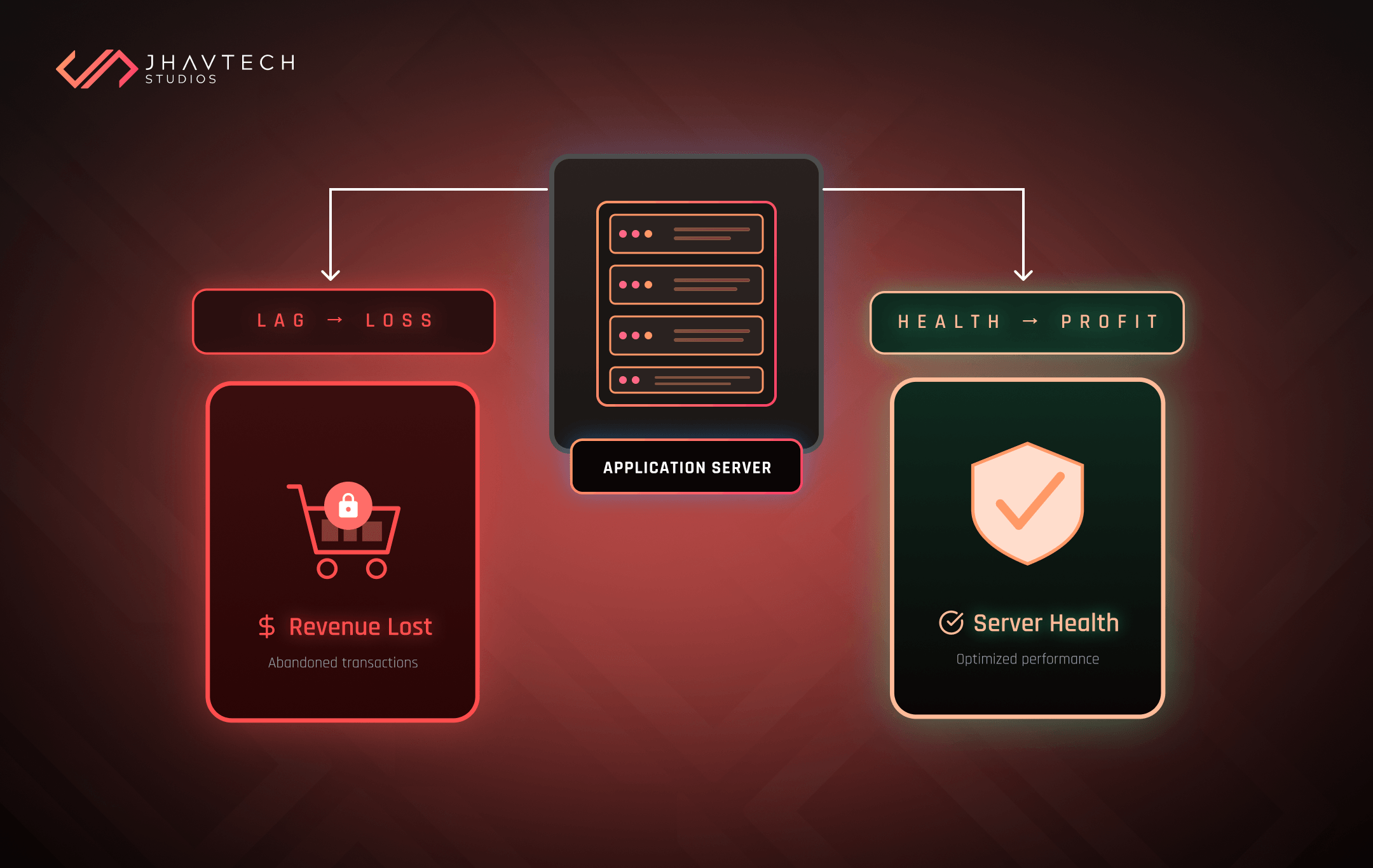
That is what makes bad mobile app UX design so dangerous for startups and SMEs. A server outage gets escalated at 2am. A failed payment gets a war room. But an onboarding flow that quietly loses six out of ten new users tends to get filed under "we need better marketing," and the budget goes to more ads pouring into the same leaky bucket.
We spend a lot of our week inside apps that are underperforming for reasons the team cannot name. The pattern repeats. So, let's talk about what is really going on, and what it is costing you.
The Numbers Behind the Quiet Death
Retention benchmarks are grim once you actually look at them. Across categories, median day-30 retention hovers around 4%. Strong performers land somewhere between 5% and 8%. Social and productivity tools do better; e-commerce and gaming usually do worse.
Read that again. For a typical app, 96 out of every 100 people who install it are gone inside a month.
Some of that you cannot prevent. People download things on a whim, poke around, move on. Fine. But a serious chunk of that churn is design, and it leaves fingerprints. The sharpest drop happens in the first session, before the user has done anything useful with your product at all. That is not a market timing problem. That is a first-run problem, and it is fixable. Usually by rethinking the first ninety seconds of the experience, not the product strategy.
Onboarding is the usual suspect. Chameleon's 2025 analysis found four-step product tours complete at 74%, while tours running seven steps or more complete at 16%. Three extra screens. Fifty-eight percentage points gone. And in almost every case we audit, those extra screens exist because someone senior wanted a feature "highlighted" in a meeting eighteen months ago.
Speed belongs in this conversation too, though most founders file it under engineering. Google and Deloitte's Milliseconds Make Millions study ran across 37 brands and more than 30 million sessions. A 0.1 second improvement in mobile load time lifted retail conversions 8.4% and average order value 9.2%. A tenth of a second. Nobody is sitting there with a stopwatch, but their patience gets spent regardless.
Six App Usability Problems That Do the Most Damage
These are the ones that turn up again and again in our audits. On their own, none of them look like an emergency. Stacked together, they are a brick wall.
1. Onboarding that takes before it gives
You know the shape of it. Splash screen. Three carousel slides explaining your value proposition. Mandatory account creation. Email verification. Permission requests for location and push. Then, finally, the app.
Every one of those was a defensible decision on its own. Stacked together, they are a wall between the user and the exact thing they downloaded your app to do. And a poor onboarding experience does more than lose people at the point of friction. It sours everything downstream, because the users who did fight their way through arrive already irritated.
Let people do something worthwhile first. Ask for commitment second. Guest mode, delayed permissions with real context attached, progressive profiling instead of a form wall on screen one. None of this is new advice. It is just routinely ignored.

2. Navigation that demands a mental model
If someone has to build a map of your app in their head before they can find anything, you have already lost most of them.
The tells are consistent: five tabs that are all somehow equally important, the primary action buried three levels deep, and a hamburger menu functioning as a junk drawer for everything the team could not agree on.
3. Feedback that is missing, or worse, lying
Tap a button. Nothing for a second and a half. Did it register? Tap again. Congratulations, duplicate order.
Loading states, disabled buttons, skeleton screens, haptic confirmation. This is not polish. This is the line between an app that feels solid and one that feels broken while the backend behaves perfectly.
4. Error messages written for developers
"Error 422: Unprocessable Entity" tells a user precisely nothing, except that something has gone wrong and it is probably their fault.
Decent error copy says what happened, why, and what to do next. It is the cheapest UI/UX optimisation win on the board. It is also, reliably, the last thing anyone gets to.
5. Performance treated as a phase-two problem
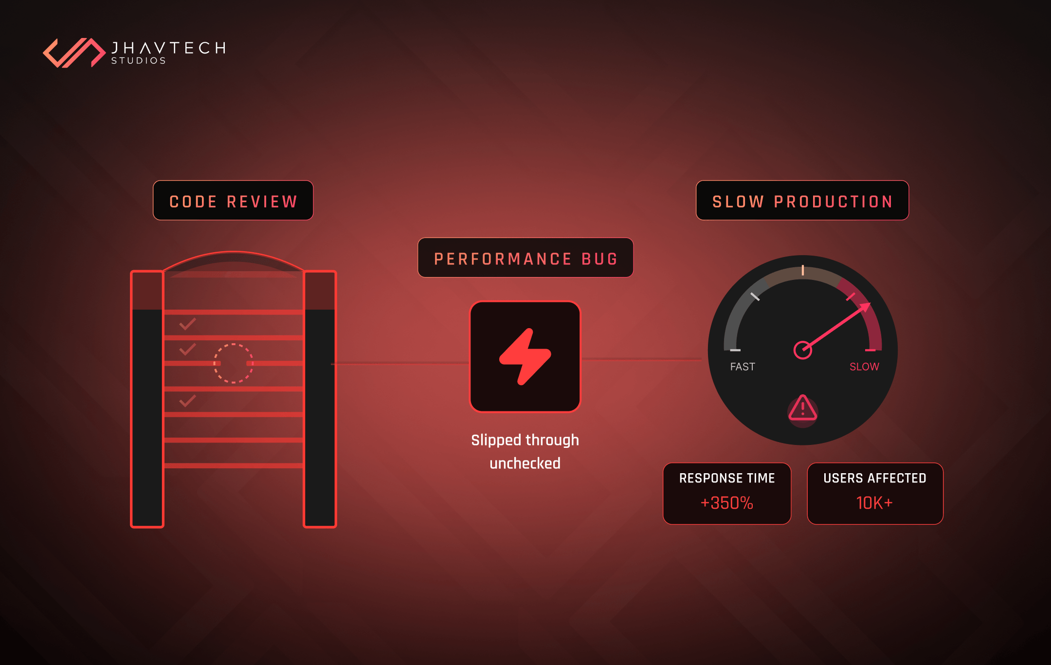
Slow launches, janky scroll, images that pop in half a second after the layout settles. Users cannot diagnose an unoptimised asset pipeline, but they can feel it, and what they feel is "cheap."
Here is the trap: performance debt compounds with every feature you ship, so phase two never actually arrives. Our piece on why small cracks in a codebase get expensive fast covers how that snowball builds.
6. Decisions made without a single real user in the room
This is the root cause sitting under most of the others.
Teams design for themselves, test on themselves, then read their own fluency as proof the thing is intuitive. Of course it is intuitive to you. You built it.
Breaking that loop costs almost nothing. Nielsen Norman Group has been saying so for two decades: five users will surface the large majority of usability problems. Five people. One afternoon. We have watched clients learn more in ninety minutes of session recordings than in a quarter of roadmap debate.
What Poor UX Actually Costs You
The reason these problems stay invisible is simple. They never appear on a line item called "UX." They surface somewhere else entirely, wearing a disguise.
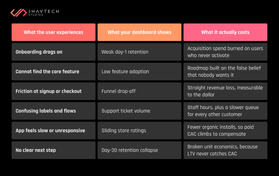
That last row is the one that ends companies.
If your acquisition cost is $9 and the average user churns before generating $9 of value, no amount of spending fixes it. You do not have a growth problem. You have a retention problem, and retention problems are nearly always experience problems wearing a growth costume.
Customer retention issues also compound in a way acquisition problems never do. Every user who leaves is someone who will not refer you, will not review you, and will remember your brand as the one that wasted their time.
A Diagnostic Checklist You Can Run This Week
You do not need a research budget or a design agency to find your worst problems. A few hours and some honesty will do it. Work through this before you commission anything from anyone, us included.
The first-run test
The friction audit
The clarity check
The evidence check
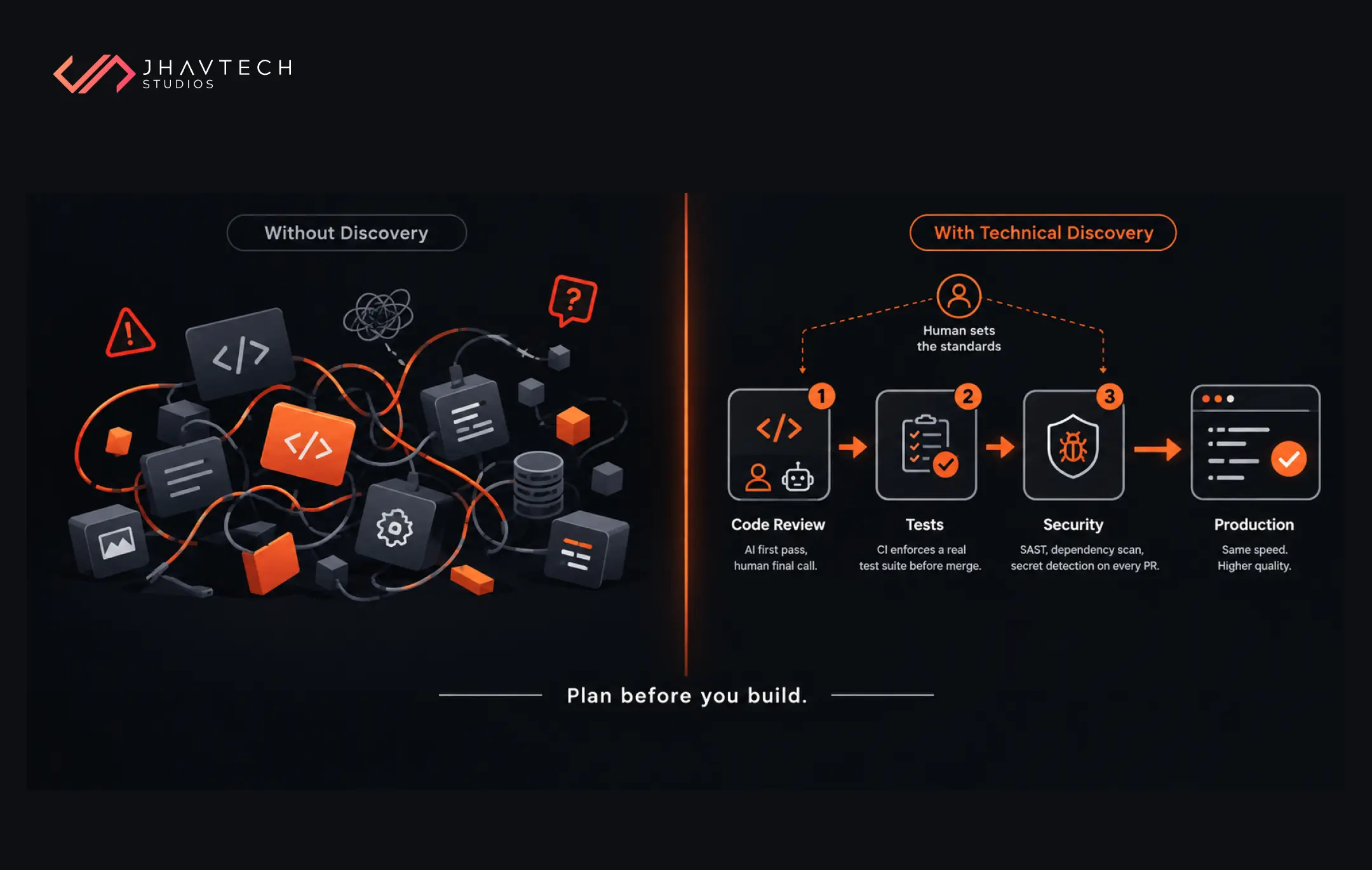
If more than a third of these are uncomfortable, the problem is not a missing feature. It is a product that never got properly validated in the first place. We covered what tends to happen when teams skip discovery and the pattern is depressingly consistent.
What UI/UX Optimisation Looks Like When It Works
Less glamorous than a redesign. Considerably more effective.
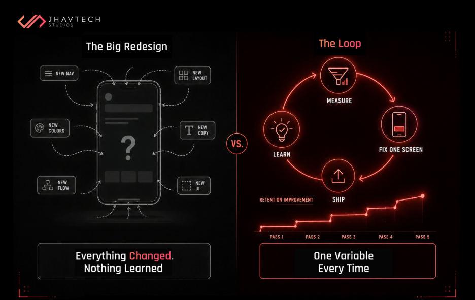
Start with instrumentation, because you cannot fix drop-off you cannot see. Funnel analytics and session replay go in before you change a single pixel. Then find the one screen losing the most users and fix that screen. Ship. Measure. Repeat.
Resist the full redesign. We understand the appeal, and occasionally it is the right call, but big-bang redesigns change so many variables at once that you learn nothing about what actually worked. Incremental changes with clean measurement teach you something every time.
Test on real devices with real users. Not your team. Not your investors. Not your mate who works in tech. People who match your actual audience, on the phones they actually own, in the conditions they actually use.
And treat UX debt exactly like technical debt: a real liability accruing real interest. Both compound. Both get pricier the longer you leave them. If the codebase itself is part of the story, have senior engineers look under the bonnet for free before you spend anything.
When the Problem Runs Deeper Than the Interface
Sometimes an audit turns up something worse.
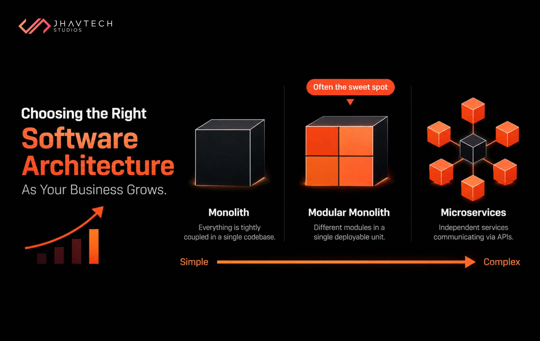
The design is not confusing because a designer made bad calls. It is confusing because the architecture underneath forces it to be. Features get bolted on sideways because the data model cannot support anything cleaner. Screens crawl because the API hands back everything at once and lets the client sort it out.
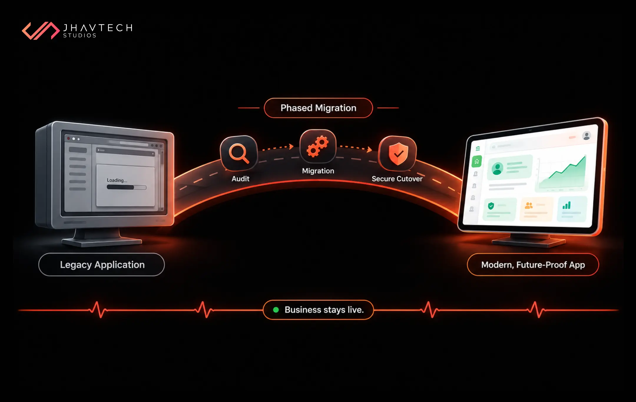
At that point, cosmetic work is money down the drain. What you need is a team that can take a struggling build and get it back on track, or an honest rebuild with the experience designed in from day one instead of painted on at the end. If you are weighing that call, our pre-launch checklist for founders is a decent gut check.
Starting fresh? The lesson is simpler. Build it properly the first time, with usability treated as a requirement rather than a nice-to-have. It is dramatically cheaper than rescuing it later. We would know. Rescue work is a big part of what we do, and almost none of it was inevitable.
The Bottom Line
Poor mobile app UX design does not announce itself. It works slowly, dressed up as a marketing problem, or bad timing, or rotten luck.
The data keeps telling the same story. Most users leave in the first session. Most of them leave because of friction you could have found by watching five people use your product. And the cost of that friction lands squarely on your acquisition budget, month after month, until the maths stops working.
The good news is that hardly any of this requires a rebuild. It requires looking honestly at what your users are experiencing, then fixing the worst thing first.
Frequently Asked Questions

.png)
.png)
.png)



.webp)
.webp)
.webp)
.webp)

.webp)
.webp)

.webp)
.webp)






.png)
.png)
.png)
.png)
.png)
.png)


.png)
.png)
.png)
.png)
.png)
.png)
.png)

.png)
.png)

.png)



.png)
.png)
.png)
.png)
.png)
.png)
.png)
.png)
.png)
.png)
.png)

.png)

.png)

.png)
.png)
.png)
.png)
.png)
.png)


.png)
.png)
.png)
.png)
.png)
.png)
.png)
.png)
.png)
.png)

.png)
.png)