.svg)
.svg)
Tips and Tricks on Designing a Mobile Application Icon that Stands Out
.png)
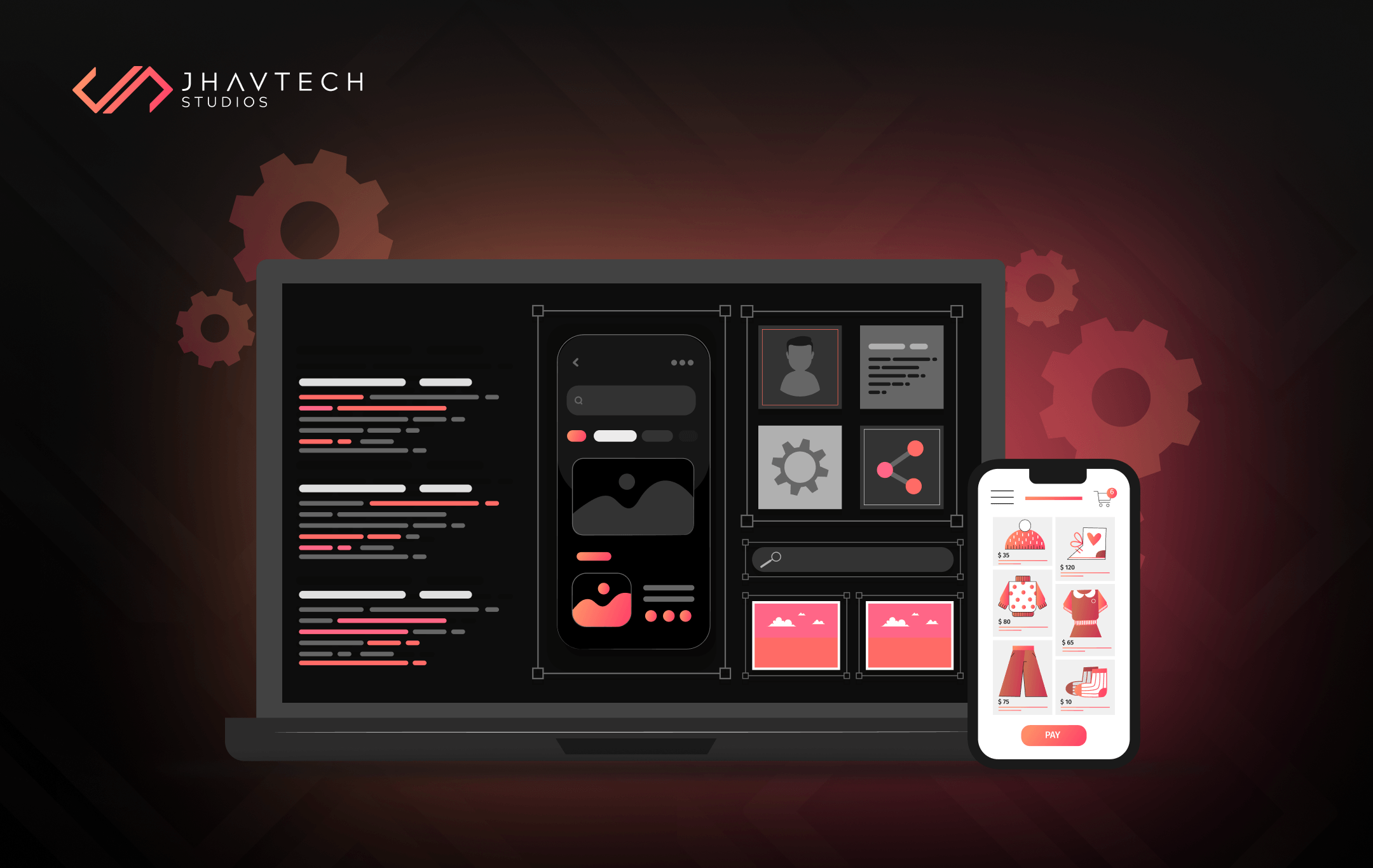
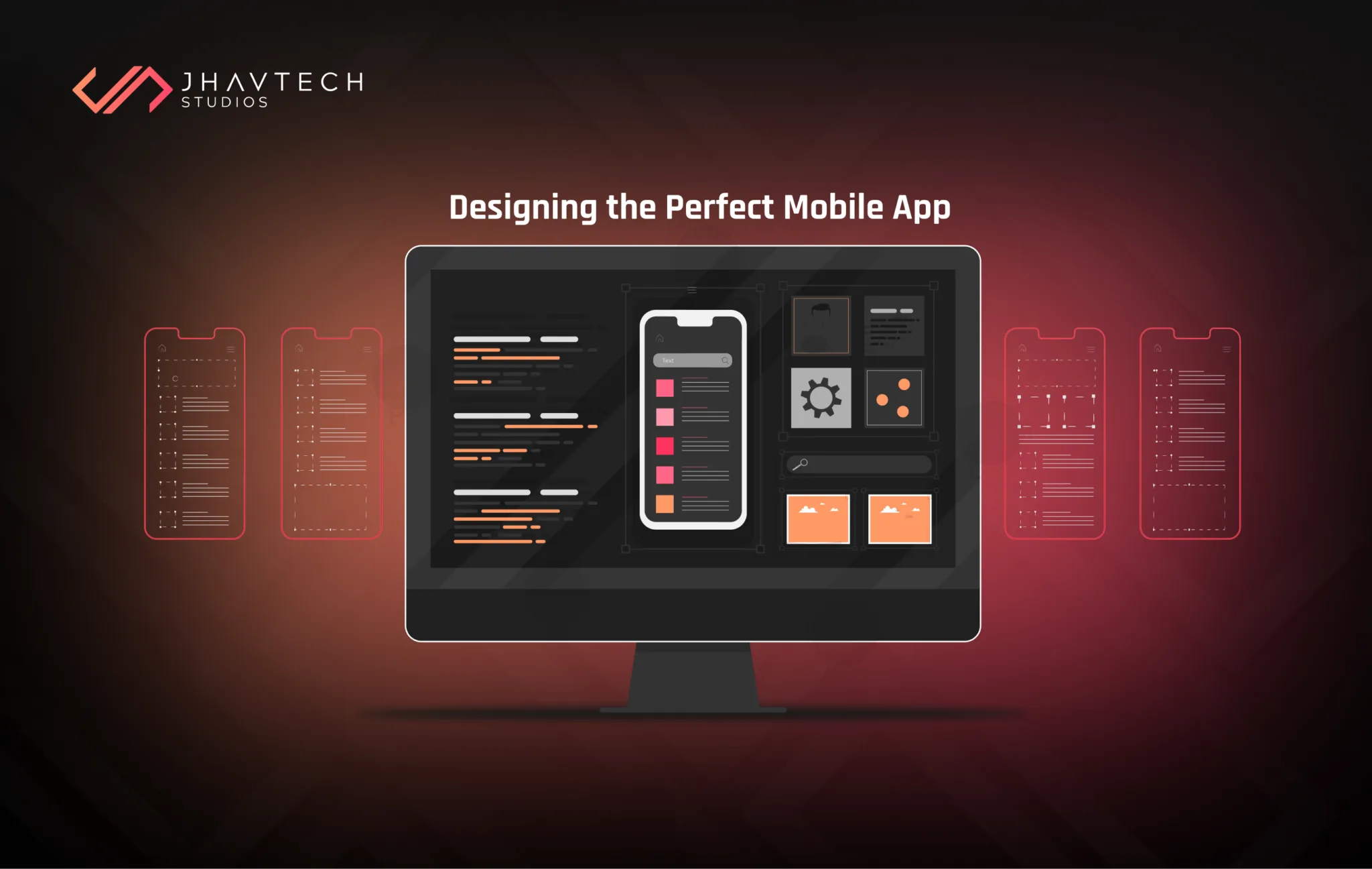
App icons serve as the visual representations of mobile apps. Just like a brand has a logo, an app has an icon. It is small in size but makes a huge contribution to an app’s success. Creating a first impression, increasing downloads, communicating an app’s function, and serving as the primary branding element are some of the crucial tasks that a mobile application icon can effectively accomplish.
That’s a lot of power that you can take full advantage of! Hence, we decided to curate a list of tips and tricks on designing mobile application icons that stand head and shoulders above the rest. Let’s get started…
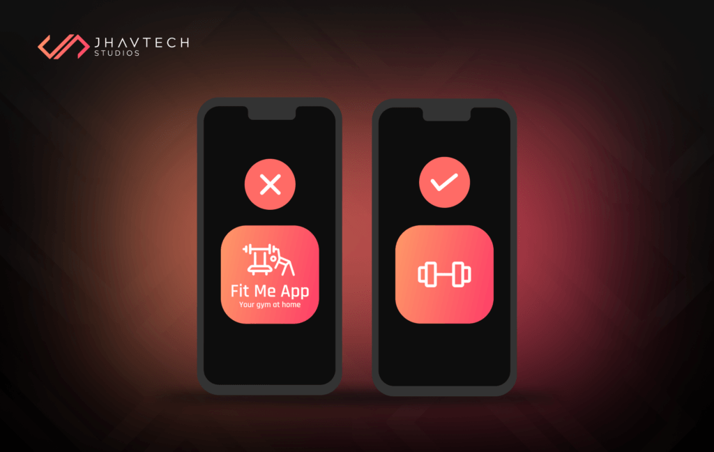
Ensuring Icon Recognisability
Making your mobile application icon easily recognisable is the most important thing to focus on. When you consider the most crucial factors that determine the success of an icon, you may think that it ought to be visually appealing, adhere to platform-specific guidelines, and be simple yet leave a mental blueprint. These are all valid points, but if the icon is not easily recognisable, you can bet that everything else will fail.
At Jhavtech Studios, we believe that simplicity is the key to achieving recognisability – but it doesn’t mean bland to the extent of being boring. It still needs to align with current UI/UX design trends. Simplicity means focusing on a concept and discarding all unnecessary elements. As our motto says, “Every pixel matters.” It applies to mobile application icon design as well since every pixel must help users understand the big idea – what the app is all about.
Another key is differentiation or the uniqueness of your mobile app icon’s design. With 1.96 million applications available for download in the App Store and 2.87 million in the Google Play Store, you have 4.83 million mobile application icons competing for attention. Popular brands can rely on their logo to attract eyeballs, but what can lesser-known mobile apps do?
Come up with something new and unique. Be creative and think outside the box. Remember that recognisability will help your icon stand out from the crowd, and this is the first step to throngs of downloads.
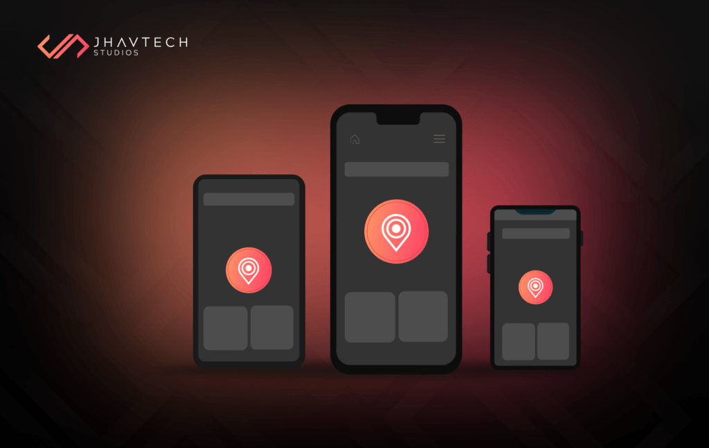
Scalability in Mobile Application Icon Design
There is no flexibility when it comes to icon size. They come in smaller and smaller sizes, and they cannot be stretched or compressed. This means legibility is a top priority for mobile app icons. They must look great in the App Store, Play Store, on AMOLED, and on Retina displays.
Aside from the home page, they also appear in sub-menus where they become even smaller. You certainly don’t want your users straining their eyes just to understand the concept of the design.
A huge part of the conceptual phase of mobile app icon design must be dedicated to determining whether a particular design will scale seamlessly. This can be achieved by testing on different types of devices, and while some loss of details is unavoidable, the main idea of the design must always be clear.
Put a premium on simplicity and concentrate on one element, preferably a unique object or a shape that retains its qualities when scaled. Also, ensure that the icon looks good against different backgrounds.
Consistency between Your App and Mobile Application Icon
An icon is part and parcel of a mobile app, so branding must stay consistent between the two. Good icon design is an indication of the quality of the app itself. The mobile app icon must provide an accurate description of the app and highlight its main features. The two should support each other to create a positive user experience.
Shaping a sleek image of your mobile app in the minds of users increases the chances of virality and boosts product satisfaction. The bottom line is that getting your icon to work with the design and functionality of your app is a huge feat, likely translating to success. You can ensure consistency between your app and its icon by aligning their color palettes and using a unified design language – for instance, a blue interface complemented by a blue icon. As much as possible, try to make the symbols of your app and its icon visually similar to reinforce the connection between the two.
Avoid Cluttering Your Icon with Text
Including text in a mobile application icon can create unnecessary visual clutter and reduce its overall impact. Icons are meant to convey a message quickly and visually, often at a glance. Since the icon appears small on mobile screens, text becomes difficult to read and may frustrate users instead of drawing them in. Relying on clear, bold visuals allows the icon to remain visually appealing and instantly recognisable.
Additionally, overloading an icon with text and imagery dilutes its purpose as a graphic representation. Users expect icons to convey meaning through shapes, colors, and symbols, not through reading. Trying to force text into the design may result in a disorganised appearance that fails to make a lasting impression.
A well-designed icon paired with a memorable app name is more effective than squeezing both elements into the same space. Keep your icon clean, simple, and intuitive to maximise its impact.
Know the Latest Design Standards for Mobile Application Icons
While there are no rigid rules beyond submission size, both Apple and Google provide guidelines that outline their expectations for mobile app icons. Adhering to these standards is essential for ensuring your app's visual compatibility with current operating systems and design trends. Icons that comply with these guidelines often appear more polished and professional, which can significantly impact how users perceive your app.
For Apple, the Human Interface Guidelines emphasise simplicity, clarity, and depth. Apple prefers flat designs with subtle gradients, vibrant colors, and clean lines that align with the overall iOS aesthetic. Rounded corners are a must, and the icon should scale well across different resolutions while retaining its visual integrity.
On the other hand, Google’s Material Design Guidelines focus on geometric shapes, consistent grid alignment, and bold, contrasting colors. The emphasis is on creating icons that are dynamic and easy to recognise within the Android ecosystem. Shadows and depth are used creatively to add a sense of realism while maintaining a clean and modern look.
Staying informed about these evolving standards not only helps with app store approval but also boosts user engagement. Apps that look up-to-date with platform-specific design cues are perceived as more relevant and trustworthy. Investing time in studying and implementing these guidelines ensures your icon not only stands out but also integrates seamlessly within the mobile environment, increasing your app’s chances of being noticed and downloaded.
Final Thoughts…
An icon is a crucial part of mobile application development because it serves as the first touchpoint with your users. A unique and meticulously designed mobile application icon can influence prospective users to download your app.
If you have an amazing app idea, make sure you don’t get lost in the shuffle because of a bad icon design. Follow our tips to set yourself up with a design that looks awesome and reaches your target audience.
We hope you found this post useful. If you have any questions or if you are interested in the services we offer, feel free to get in touch with our team. Contact us today or request a no-obligation quote
.png)
.png)
.png)
.png)

.png)

.png)
.png)
.png)
.png)
.png)
.png)
.png)
.png)

.png)
.png)
.png)
.png)

.png)
.png)

.png)
.png)
.png)

.png)


.png)


.png)


.png)


.png)


.png)


.png)
.png)

.png)
.png)


.png)

.png)


.png)
.png)


.png)
.png)
.png)

.png)