.svg)
.svg)

Many businesses approach software development with a singular focus: launching their product. They rightly prioritise functionality and speed. However, crucial aspects like user interface (UI) and user experience (UX) are often overlooked in that rush to market. In today’s crowded digital space, this is a costly mistake. UI/UX isn’t just about making things look pretty; it directly impacts how users interact with your software and your business’ success. Ignoring these elements leads to fewer engaged users, lower sales conversions, and a direct hit to your revenue.
How Important is UI & UX?
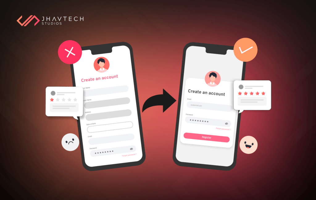
Imagine opening a food delivery app, starving and ready to order, only to be greeted by a chaotic design that’s hard to navigate. Tiny buttons, confusing layouts, and everything fighting for your attention make it feel like the app is working against you. When you finally manage to find your meal, the checkout is a maze of forms and cryptic errors. This poor experience isn’t just frustrating—it’s costing the business potential customers.
And that’s why users leave. In today’s digital world, where alternatives are just a tap away, frustration is a deal-breaker. Research shows that a poor user experience leads directly to lost customers and revenue. When your app is difficult to navigate or unpleasant to use, users will abandon it. Research supports this: Forrester Research found that well-designed user interfaces can increase conversion rates by up to 200%, and exceptional UX design can boost them by up to 400%. Investing in both UI/UX design is essential for the success of your product.
Furthermore, a negative user experience damages your brand reputation. Negative reviews and word-of-mouth spread like wildfire, eroding customer trust and loyalty. In today’s digital age, where online reviews heavily influence purchasing decisions, a damaged reputation can be catastrophic.
Finally, redesigning and re-developing software due to poor initial design significantly increases development costs. Getting the design right from the start is always cheaper and more efficient.
Key Indicators of Poor UI/UX Design
High Bounce Rates
A rapid exit from your site suggests users either couldn’t find what they were seeking or were put off by the design. Poor layout, cluttered visuals, or a confusing interface can drive users away within seconds. For reference, a bounce rate above 70% (depending on the industry) may indicate significant UX issues that need to be addressed.
Negative User Feedback
Ongoing complaints about usability or functionality suggest challenges with your website or app’s user experience.
For example, if users frequently mention broken links, hard-to-read text, or confusing menus, these are red flags. Negative feedback is a goldmine for identifying and prioritising UX improvements that directly affect user satisfaction.
Low Conversion Rates
Difficult navigation or barriers to completing desired actions can prevent users from becoming customers. According to Baymard Institute, nearly 70% of online shopping carts are abandoned, often due to bad UX design.
Slow Task Completion
When users take longer than expected to complete basic tasks—such as filling out a form, locating key information, or booking an appointment—it’s a sign that your interface is unintuitive or overly complex. In productivity or enterprise apps, this directly affects efficiency and user satisfaction, leading to churn in B2B environments.
Navigation Issues
Frequent user confusion or trouble finding essential content points to problems with your site’s navigation structure. If people struggle to find information or perform actions without a learning curve, they’re more likely to give up. Good navigation reduces cognitive load and helps users find what they need within three clicks—a common UX benchmark.
Inconsistent Design
A disjointed or inconsistent design can bewilder visitors and weaken your brand’s identity. When fonts, colours, button styles, and layout rules aren’t consistently applied, it disrupts the visual experience and creates confusion. Consistency across all screens and devices is a hallmark of good UI/UX and reinforces brand identity.
Poor Mobile Optimisation
With over 55% of global web traffic coming from mobile devices (Statista, 2023), neglecting mobile UX can severely impact engagement. Examples include text that’s too small to read, buttons that are hard to tap, or images that don’t scale properly. A responsive, mobile-first approach is no longer optional—it’s a baseline expectation.
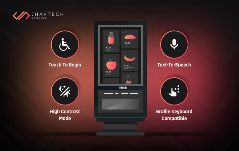
Accessibility Concerns
An inaccessible user interface that doesn’t cater to people with disabilities can limit your audience, potentially violate accessibility regulations (like WCAG 2.1), and can lead to legal consequences. If your app or website isn’t designed to accommodate users with disabilities—such as those who rely on screen readers or keyboard navigation—you risk excluding a significant portion of the population. Inclusive design benefits everyone, improving usability for all user groups.
How Our Design Team Can Help: Your UX Partners
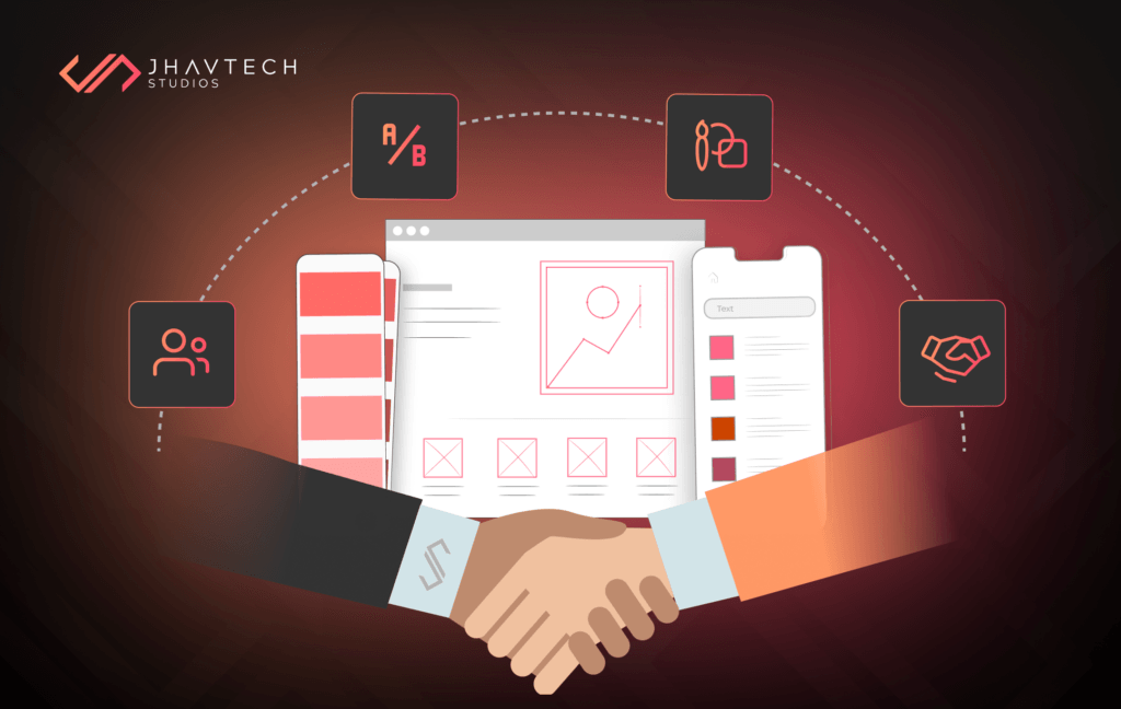
At Jhavtech Studios, our design team is dedicated to creating seamless, user-centered digital experiences that prioritise your users’ needs, ensuring higher engagement, satisfaction, and business success.
User-Centric Approach:
Our design process starts with a deep understanding of your users. By focusing on their needs, behaviours, and preferences, we craft experiences that resonate with your audience, increasing engagement, boosting conversions, and fostering brand loyalty.
Usability Testing and Optimisation:
We believe in continuous improvement. Our team conducts thorough usability testing to identify potential issues before they affect users. By optimising every design, we ensure your product meets industry standards and provides a delightful, efficient experience for users.
Intuitive Interfaces and Memorable Experiences:
Our UI/UX design services are focused on creating intuitive interfaces that are easy to navigate and visually appealing. We aim to simplify interactions while ensuring users have a memorable experience, encouraging them to return to your app or website.
Collaboration and Communication:
Effective communication is key to great design. Our team works closely with clients through virtual meetings, emails, and messaging apps, ensuring transparency and openness to feedback. This collaboration helps us create designs that meet your exact needs and exceed expectations.
Final Thoughts…
At Jhavtech Studios, we deliver high-quality, user-friendly designs that not only enhance your product’s performance but also provide a memorable user experience, ultimately driving your brand’s success.
Ready to Turn User Experience Into Your Competitive Advantage?
Neglecting UI/UX is no longer an option in today’s experience-driven digital landscape. The cost of frustrated users, lost conversions, and a tarnished brand reputation can be far greater than the investment in quality design. At Jhavtech Studios, we believe great design is not a luxury—it’s a necessity for sustainable success.
Whether you’re building from scratch or looking to improve an existing product, our UX experts are here to help you deliver a digital experience your users will love—and remember.
👉 Let’s talk. Contact us today and discover how we can elevate your digital product