.svg)
.svg)
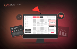
If your mobile app is suffering from low engagement, high bounce rates, poor user reviews, or declining revenue, the problem may not lie in the backend code—it could be the design.
In today’s overcrowded app marketplace, user expectations are sky-high. A clunky, outdated, or frustrating design is a surefire way to lose users. That’s why a strategic UI/UX redesign isn’t just a design tweak—it’s often a critical business decision.
In this blog, we’ll explore:
- Why UI and UX design matter more than ever
- Key signs your app needs a UI/UX redesign
- How the right design changes can turn performance around
- Real-world examples and actionable strategies
Let’s jump in and show you how smart design choices can give your mobile app a second wind.
What’s the Difference Between UX and UI?
Before diving into solutions, let’s clear up the basics:
| Element | Description | Focus |
| UX (User Experience) | How users interact with your app—the structure, flow, and satisfaction. | Functionality & usability |
| UI (User Interface) | The visual elements—layout, buttons, icons, typography, and colors. | Aesthetic & interactivity |
Think of user experience as the blueprint of a house and user interface as the interior design. You need both to create a home people want to live in—or in this case, an app people want to keep using.
Still wondering why the distinction matters? UX is about solving user problems and ensuring ease of use, while UI is about delighting users visually and making every interaction feel intuitive. A beautifully designed app with poor usability won’t retain users, just as a highly functional app with an ugly interface will fail to attract them. Striking a balance between both is what makes a UI/UX redesign powerful.
Signs Your App Needs a UI/UX Redesign
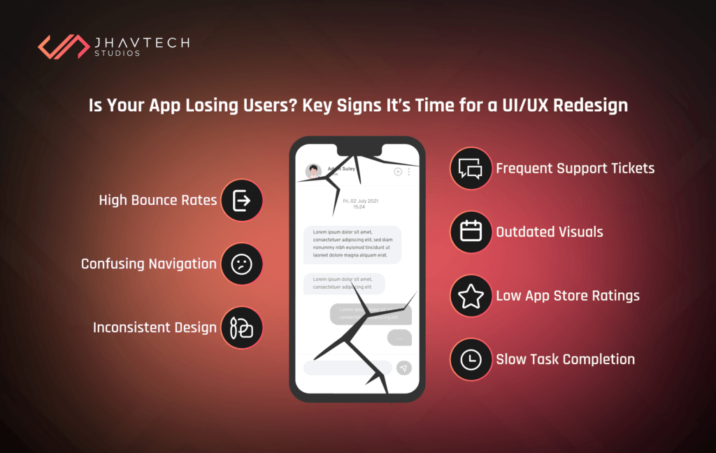
How do you know if your mobile app is silently bleeding users because of poor design? Here are the most common red flags—each one a clear signal that it’s time for a UI/UX overhaul:
High Bounce or Abandonment Rates:
If users are exiting your app shortly after launching it or before completing a core task (like signing up or checking out), that’s a major red flag. It usually points to a frustrating or confusing experience that’s driving them away.
Confusing Navigation:
When users can’t figure out where to go or how to accomplish their goals within your app, they don’t stick around. Poorly structured menus, unclear icons, or buried features all contribute to navigation issues.
Inconsistent Design Elements:
If your app uses different button styles, font sizes, or color schemes across screens, it can feel disjointed and unprofessional. This inconsistency erodes trust and gives users the impression that your app isn’t fully polished.
Frequent Support Tickets or Complaints:
A high volume of customer support inquiries is often the symptom of a bad UI/UX. If users have to reach out just to understand how your app works, the design isn’t doing its job.
Outdated Visuals:
Design trends evolve quickly. Apps that still look like they were made in 2015 can come off as outdated, which makes users question whether the app—and the company behind it—is reliable and current.
Low App Store Ratings:
App store reviews reflect user sentiment. If your design frustrates or confuses people, they’ll make their opinions known. Consistently low ratings are a clear indicator that your UI or UX needs serious attention.
Slow Task Completion:
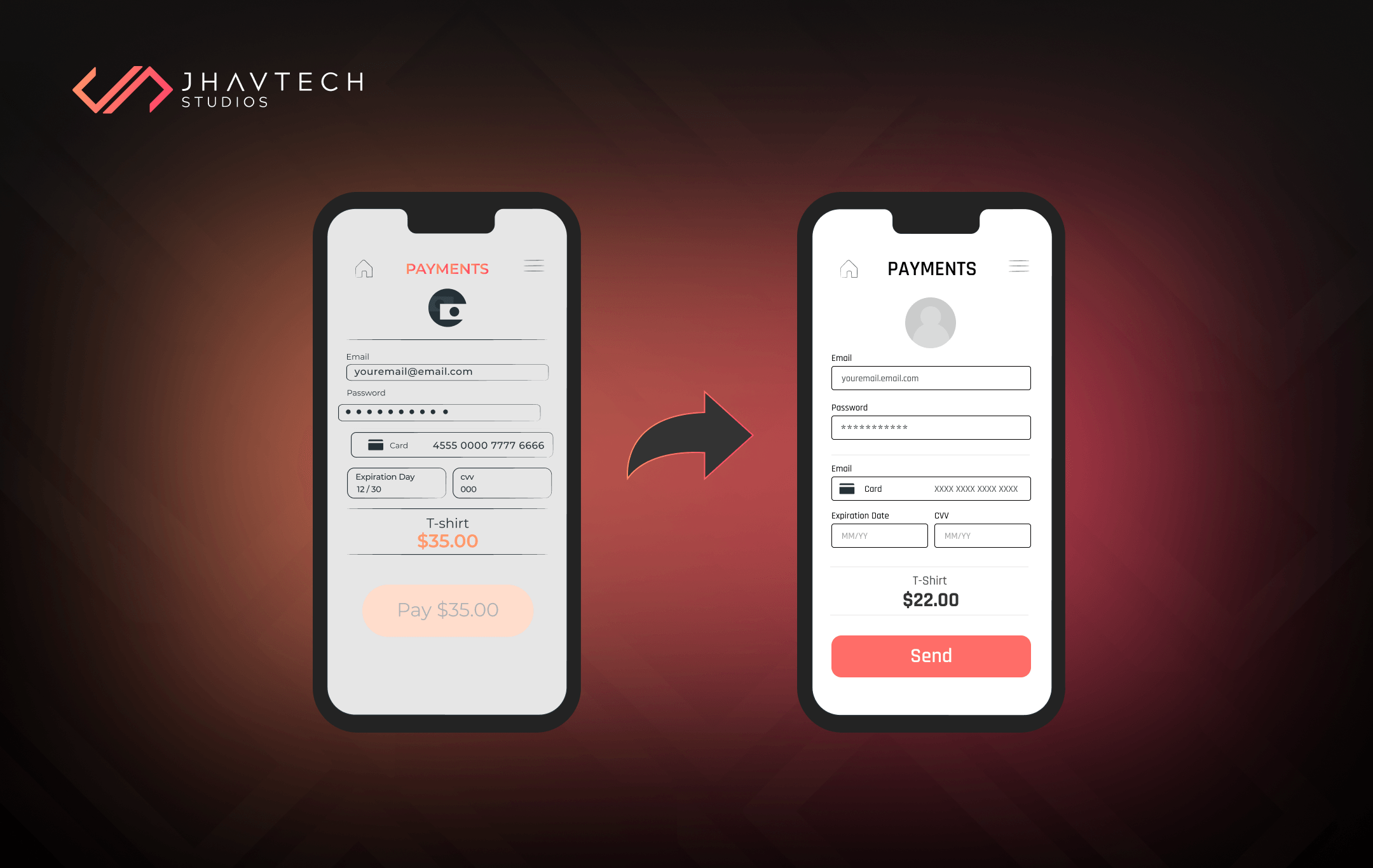
If a simple task—like filling out a form or making a payment—takes too many steps or isn’t intuitive, users will abandon the process. Poor task flow directly impacts your conversion rates.
💡 Curious about how your app measures up? Our team offers a UX Audit and Rescue Assessment to identify key issues and solutions.
Why UI/UX Design Is a Make-or-Break Factor
Let’s talk numbers. A study conducted by Google revealed that 53% of users abandon a mobile site (or app) that takes more than 3 seconds to load. But even if your performance is lightning-fast, bad design kills conversions.
What Good UI/UX Brings:
- 66% of users say a seamless experience is more important than price when it comes to mobile apps. (Salesforce, 2023)
- 75% of users judge a company’s credibility based on its app or website design. (Stanford Web Credibility Research)
- Increased retention, engagement, and positive reviews
What Bad UI/UX Costs You:
- Users abandoning before onboarding is complete
- Negative word-of-mouth or low App Store ratings
- A direct hit to revenue, especially for subscription-based apps
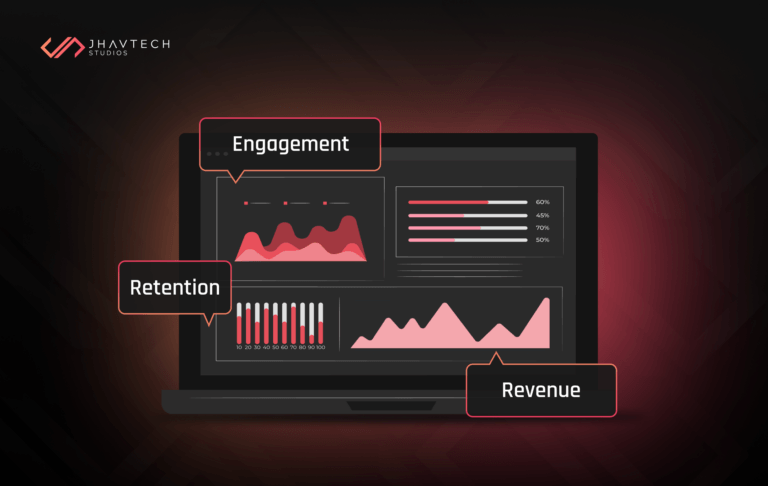
A UI/UX redesign can directly influence the business metrics that matter—conversions, reviews, revenue, and retention.
Check out our Mobile App Development Services for end-to-end UX and UI support.
Common App UI/UX Design Questions
❓ Why is my mobile app not converting users?
Often, the root cause is poor UX—things like unclear CTAs, confusing flows, or a lack of visual hierarchy. A UI/UX redesign can pinpoint and fix those gaps.
❓ How do I improve the UI of my app?
Start with a UX audit, gather user feedback, and update the visual layer using modern design principles (like Material Design or Apple’s Human Interface Guidelines).
❓ Does design really affect app downloads?
Absolutely. A polished UI boosts user trust and app store reviews—which, in turn, increases your visibility and downloads.
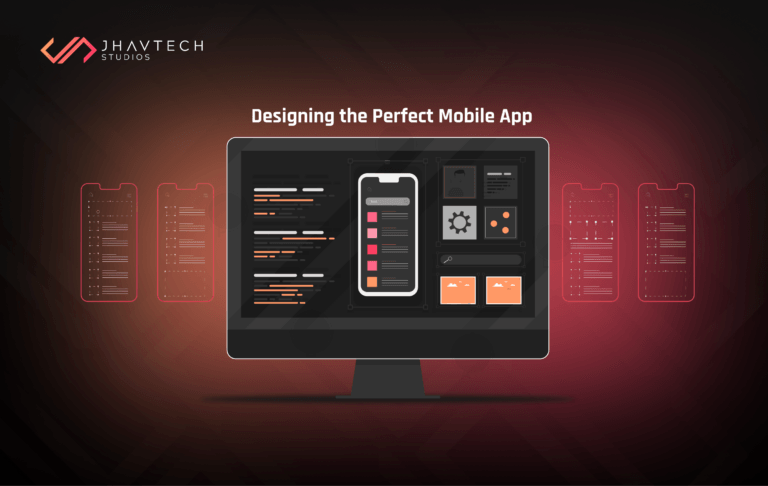
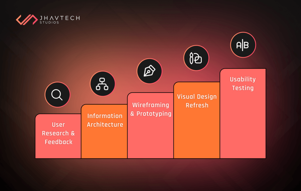
What a UI/UX Redesign Involves
So, what does a full UI/UX redesign actually look like? It’s more than a few button changes—it’s a comprehensive strategy to fix the user journey from end to end.
User Research and Feedback Analysis
Understanding how users interact with your app is the first step in any successful redesign. By studying actual user behavior and collecting direct feedback, you can identify pain points and opportunities for improvement—making sure every design decision is backed by real data.
Gather real insights into how users behave and where they struggle:
- Heatmaps
- Session replays
- Survey results
- App reviews
Information Architecture Restructuring
Reorganise how your app flows—simplifying screen hierarchy and user paths to get users where they want to go, faster. A well-structured information architecture reduces cognitive load and ensures users can intuitively find what they need without frustration. This step is critical for improving usability, especially in feature-rich apps where poor organisation can quickly overwhelm or confuse users.
Wireframing and Prototyping
This stage bridges the gap between concept and execution. Wireframes help define the structure and layout of each screen, ensuring clarity in how users will navigate your app. Prototypes then bring these designs to life, allowing you to test interactions and gather feedback before development begins. Build initial wireframes to visualise new flows. Then, move into high-fidelity, clickable prototypes using tools like:
- Figma
- Sketch
- Adobe XD
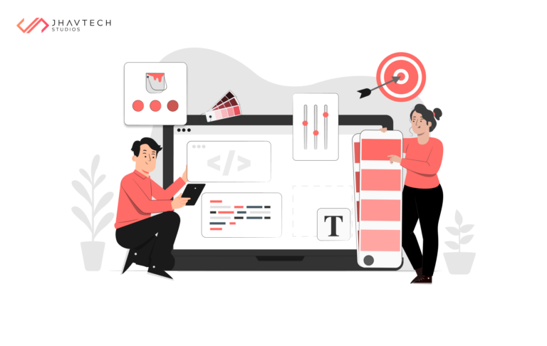
Visual Design Refresh
A modern, cohesive visual style can dramatically elevate your app’s perceived value and usability. At this stage, the focus is on aligning the interface with current design standards and your brand identity to create a polished, professional experience that users instantly trust.
So, it’s time to modernise the look and feel:
- Update fonts, colors, icons, and spacing
- Apply consistent branding
- Introduce motion or transitions where appropriate
Usability Testing
Before releasing your redesigned app, it’s crucial to validate your changes through real-world testing. Observing actual users as they interact with the app helps uncover pain points that might not be obvious in design mockups. This step ensures that the new experience is intuitive, effective, and truly solves the problems it set out to fix—before it reaches your broader audience.
🧬 Pro Tip: Test with a mix of new and existing users for balanced feedback
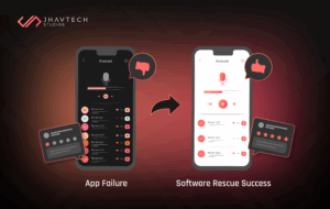
Real-Life App Rescue Through UI/UX Redesign
Here’s a quick case study from one of our recent projects in Sydney:
| Metric | Before Redesign | After Redesign |
| User Drop-off (Profile Setup) | 34% | 8% |
| App Store Rating | 2.7 stars | 4.4 stars |
| Avg. Session Time | 2.1 minutes | 3.0 minutes |
What We Did:
As part of our UI/UX redesign, we implemented several key changes aimed at improving user experience and boosting performance.
Simplified Onboarding Process
We streamlined the onboarding to reduce friction, allowing users to sign up and get started quickly. This led to fewer drop-offs during the initial stages.
Reorganised Dashboard Layout
We made the dashboard more intuitive by organising features logically, making navigation easier and tasks more efficient, which improved user satisfaction.
Improved CTA Placement and Color Contrast
We enhanced the visibility and placement of call-to-action (CTA) buttons, ensuring they were easier to notice and interact with, which boosted conversions.
Progress Indicators for Multi-Step Forms
We introduced progress indicators to guide users through multi-step forms, reducing frustration and increasing completion rates.
Impact on Engagement and Retention
Within six weeks of the redesign, user engagement and retention metrics saw dramatic improvements, proving the effectiveness of these targeted UI/UX changes.
Whether you’re in Sydney, Melbourne or Brisbane, we offer:
Bonus: Don’t Overlook Microinteractions
What are they? Microinteractions are those tiny details—like loading animations, button hovers, or error messages—that make a huge difference in perceived usability. They’re a subtle yet powerful part of any effective UI/UX redesign.
Well-placed microinteractions:
- Give users feedback
- Guide them through complex processes
- Make the experience feel more polished and responsive
When done right, they can add delight without distracting from the task at hand.
Final Thoughts: Design Is the Silent Salesperson
Here’s the truth: your app’s design speaks before your content does. A great product with a bad UI/UX will get ignored. A decent product with exceptional design? It might just go viral.
A UI/UX redesign is not just a facelift—it’s a growth strategy that can completely turn your app around. If your mobile app is falling behind, don’t blame your users—blame the experience.
🎯 Ready to fix it? If your app needs a second chance, talk to our software rescue team today and let’s design your way back to success.
UI/UX Redesign FAQs
How long does a mobile app redesign take?
Typically, 4–8 weeks depending on complexity and feature count.
Will redesigning the UI affect existing features?
Not always. We can work around your current infrastructure or integrate into a larger rebuild.
Is a redesign expensive?
Not compared to what you’re losing every day due to poor UX. We offer flexible pricing for startups and enterprises alike.
Should I redesign the whole app or just parts?
Start with a UX audit to determine what needs fixing—sometimes a partial UI/UX redesign is all you need.