.svg)
.svg)
The mobile world is teeming with apps, but it is far from being saturated. If you design and develop a useful mobile app, there’s still lots of room for success. However, the competition is extremely high, and you must build a high-performance app that offers quick and effective solutions to problems that your target audience is struggling to deal with.
During the planning and conceptualisation stage, anticipate and address all possible issues so they don’t pop up and slow you down later on. It should have an impressive user interface (UI) and it must deliver a splendid user experience (UX). If you fail in these two aspects, don’t be surprised if your app gets ditched by app stores.
UI and UX are the keys to the success of an app. The fiery visionary Steve Jobs once stated, “Design is not just what it looks like or feels like, design is how it works.” You can’t argue with that. An app with an exceptional design doesn’t simply mean it looks good, it must also deliver results in a seamless manner. It guides the user with ease, step-by-step, until the goal is achieved, whether it’s a download, a sign-up or a sale.
Apps that don’t overwhelm users with cognitive overload and confusing instigation are most often the ones that stand out. A study revealed that roughly 23% of apps only get used once, meaning that one out of every four apps gets uninstalled after a single use. This high abandonment rate illustrates that mobile app design, mobile app development, UI, and UX must be improved upon by leaps and bounds.
If you’re considering creating a mobile app for your business, then you’re reading the right post. We have collated a detailed dossier of the essential app design principles that you can apply so your app can deliver the finest user interface and the best user experience. This guide will spare some of the hassles and headaches of designing a mobile app that will blow your target users away.
Tools to Use
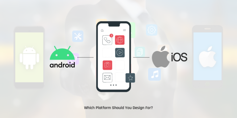
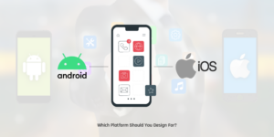
Before deciding which tools to use, you must know what platform you’re designing for: Android or iOS. Once you’ve figured it out, choose the appropriate design tools to get the job done. The good thing about designing mobile apps is that regardless of the platform, you can use the same tools.
The top options include the following:
Sketch
a highly popular iOS-based tool that you can try during a 30-day free trial. Learning the basics is easy but mastering it takes significant time and effort. Sketch is focused on UI/UX design and with its vast libraries, you can build, update and share a single source for a certain design component. Use Sync Cloud to make it easy to share styles and symbols across different documents. Sketch also comes with plenty of useful plugins
Adobe Photoshop
an image editing software compatible with Microsoft Windows and macOS. You can go for the free seven-day trial before deciding whether to purchase the software or not. It has a middle learning curve, meaning the basics are easy to understand, but just like Sketch, learning all the tricks takes considerable time and effort. Photoshop has been one of the top designer choices for years. It has the finest export options when it comes to pixel-based graphics. Users can also accurately control the quality of their graphics with this tool.
Adobe Experience Design (XD)
the direct rival of Sketch. You’ll love it if you are a PC fan and wanting to use it even if it exclusively supports Mac. XD offers all the features of Sketch including prototyping, wireframing, and more. XD is surprisingly fast and easy to use. Even if it’s still in preview state and only supports Windows 10 Anniversary Update, a lot of mobile app designers have used it and loved it. XD is promising and perfect if you’re contemplating cross-platform development, but it is not as good as Sketch yet.
BuildFire
an end-to-end app development platform that works equally well as a mobile app design tool. It allows you to build a working prototype of the mobile app that you’re designing. BuildFire boasts fully customisable functionality, so you can upload your designs, customise fonts, colours, among others. This platform has everything you need to build a fully functioning app that you can publish to the IOS and Google Play stores. You can create your prototype for Android and Apple users alike and test it on your smartphone for free. You only need to pay when you’re ready to publish.
InVision
a modern design software compatible with Google Chrome, Microsoft Edge, Internet Explorer, Firefox, and Safari browsers. InVision is easy to learn and ideal for developing mockup designs and interactive clickable prototypes. You can share your files and discuss projects inside the app for easy and smooth collaboration.
There are a lot more, but the five tools mentioned above are the heavy hitters in the industry. Others worth noting include Avocode, 3ds Max, Adobe Illustrator, Figma, Zeplin, Marvel, Origami Studio, Balsamiq, HotGloo, Axure RP, Proto.io, OmniGraffe, JustInMind, Flinto, Framer JS, Iconjar, UXPin, Fluid UI, MindNode, and Venngage.
Each of the aforementioned tools have the ability to shape mobile app development and designs of the future. You can use them to make perfect UI and exceptional work that takes user experience to new levels. However, regardless of the tool you choose to use, there are pros and cons to consider. Make sure it suits your skills and project requirements. There is no perfect software for all tasks, but there is certainly a good one for every task.
OS Design Guidelines
Before you get going, you need to know the dos and don’ts of your target platform. In general, mobile app development and design shares similarities among operating systems, including the following:
- Goal-driven design
- Less is more (keep it simple)
- Readability is key
- Maintain the flow
- Focus on end user benefit
- Keep scalability in mind
- Respect the platform
That last one is actually more important than you may think. Every time an app is downloaded and installed, users expect it to function in a way that’s familiar to them. Their perception and opinions about the app depends largely on what they know, so if an app breaches the OS-specific design rules, users are most likely to delete it.
Aside from considering the various navigation patterns that Android and iOS have, you also need to take into account the buttons, font selection, color scheme, and placement of UI items – all of which differ for each OS.
The good news is that you don’t have to guess what is widely acceptable. Both Android and Apple have a set of design guidelines that you can study before starting and while you are designing:
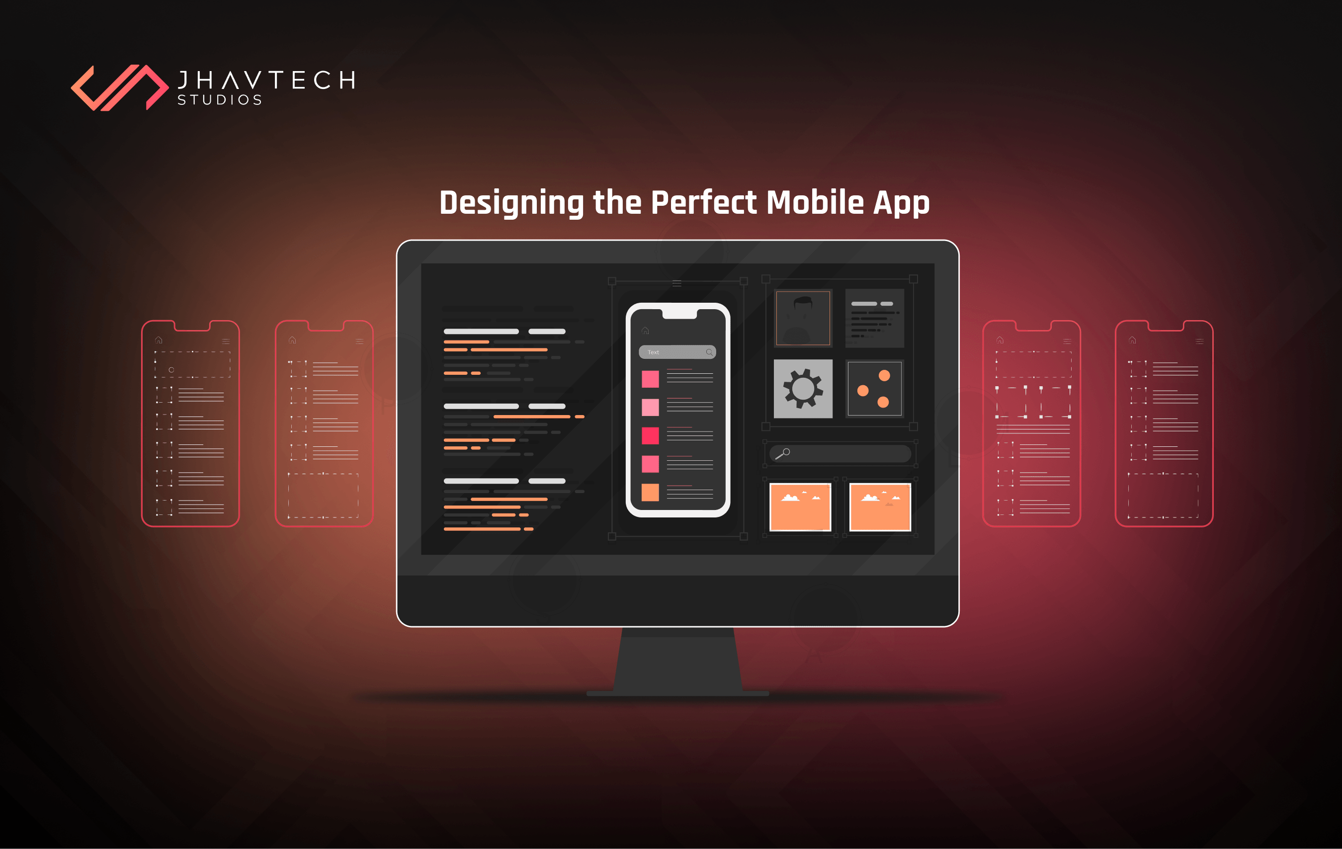
App Flow and Wireframes
Before designing the look and feel of an app, it’s imperative that you work on its structure and flow control. It’s here where wireframes come into the picture. Wireframes are the backbone of mobile app design. They will show you how users will navigate and use an app. They are simplified in their design so the main focus is on flow and functionality.
If you’ve seen a building project, you probably saw the architectural blueprints which were created prior to the actual construction process. It’s precisely what a wireframe does for designing a mobile app. It is like creating a mind map of steps on how to start mobile app design. It provides a clear idea about object categories, content hierarchy, screen elements, and visual brand elements.
While there are lots of dedicated wireframe tools, some designers still opt to use pen and paper. However, if you want something more advanced and collaborative, consider creating your wireframes in one of the tools enumerated in the preceding section. For instance, you can use Sketch or Adobe XD, as these allow you to convert your low-fidelity wireframes into high-fidelity previews with ease.
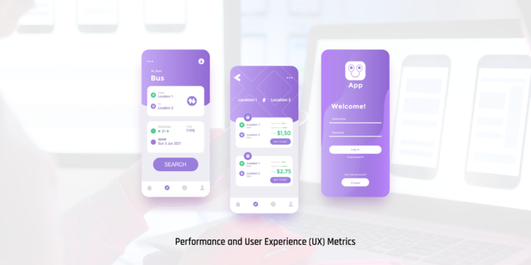
Mockups and Prototypes
Let us first differentiate a mockup from a prototype, as these two are often used synonymously. A mockup is like a high-fidelity static design diagram that shows information frames along with statically present content and functions. It looks like a finished product but it is not interactive and not clickable. On the other hand, a prototype is very close to the finished product. With it you can simulate processes and test user interaction. A prototype is an excellent tool for testing the product and for obtaining user feedback.
Once you’re done working on your wireframes and shared them with your client for approval, the next step is to create some mockups and prototypes. This is usually easier if you used the same tool to make your wireframes and mobile app design. Many tools include different ways to annotate your wireframes with all the information needed by developers. This eliminates any guesswork and makes the process simpler and easier. While working on your app’s design, it is advisable to begin building a shared library of assets. For instance, standard icons, buttons, and other elements that you create may prove useful for other apps that you’ll design later on, so make sure you save them.
Mockups and prototypes form the early stages of the mobile app development sequence. They give UI and UX designers the chance to conduct user testing at each phase of the design process. User testing helps designers to determine if a mobile app suits its target audience, how users navigate and draw value from it, and whether it meets expectations. Conducting user testing for every version of the design — from the earliest low-fidelity wireframe to high-fidelity prototype, will yield a well-rounded mobile app that delivers value to the end users.

Best Practices in Mobile App Design
Keep Cognitive Load to a Minimum
Cognitive load pertains to the amount of brain power needed to use the mobile app. The human brain can only process a limited amount of information at a time, so when an app provides too much information simultaneously, it can overwhelm users and force them to abandon the task.
Declutter
Clutter is one of the worst enemies of good design. This is related to the previous section because cluttering your interface overwhelms users’ minds with too much information. Every additional element on the screen makes the app more complicated.
Clutter is horrible on desktop, but it is far worse on mobile because there’s less real estate available. It’s imperative to get rid of any design element that isn’t absolutely necessary because reducing clutter significantly improves comprehension. You can declutter effectively by following the functional minimalism technique:
Use single focal point per screen
This adheres to the norm of “one concept, one page” wherein you design each page and/or screen to focus on only a single concept.
Design the top section of a page to set high expectations
The top section must convey a good impression and prod users to scroll down to get additional information.
Write a crisp copy
Keep content to a minimum by getting rid of all the unnecessary text. Present users with only what they need to know. Edit your content in such a way that it only includes the bare minimum of information required to explain your message.
Simplify your navigation
One of the top objectives of mobile app design is creating intuitive navigation experience. Be cautious with patterns like the so-called ‘hamburger menu’, which can help in simplifying your UI but can also make the navigation options less accessible. In most instances, navigation options that are permanently visible work better for end users.
Use subtle animated effect
Using well-conceived animated effects is a great way to engage users into interaction with your app. However, you must always keep the principles of minimalism under consideration.
Use progressive disclosure
In this technique, the interface shows more options after interaction. This is often used to make mobile apps easier to learn and less prone to errors. It does this by deferring some advanced or seldom used features to a secondary screen.
Offload Tasks
Look for elements in the design that requires user effort and search for alternatives. For instance, you can reuse previously entered info instead of prompting the user to type again or use available data to set a smart default.
Divide Tasks into Discrete Subtasks
If a task consists of multiple steps and actions to be taken by users, it’s advisable to divide them into subtasks. This technique is very important in mobile app design because you don’t want users to perceive complexity at any given time. A good example is a step-by-step checkout process in an e-commerce app, where the designer breaks down a complex checkout flow into smaller chunks, each requiring user action.
This technique is called chunking and it is effective in making a form look less loaded, particularly when you are requesting a lot of details from users. It can also help in linking two different activities like browsing and purchasing. When a flow is presented as a series of logically connected steps, users can easily proceed through it.
Keep User Input to a Minimum
Typing on a small smartphone screen isn’t very convenient. It will never be as comfortable as using a traditional keyboard and error rate is much higher. By far the most common example of user input is filling out a form. The following are practical recommendations to simplify this process:
- Keep forms as simple and as short as possible by discarding any redundant or unnecessary fields. They are blockers and must be left out. The app should only ask for the most important information from users.
- The norm in form design is ‘the shorter the better’, so combine several fields into a single, easy-to-fill field. Another rule of thumb is to present fields in a single column layout.
- Use smart features like autocomplete. For instance, filling out the address field is one of the most problematic parts of registration forms. Using tools with geo-location and prefilling allows users to enter their address with fewer keystrokes as compared to filling out a regular input field.
- Use input masks. An input mask provides a means to control the type of data that can be entered into a form’s field. A mask appears once a user concentrates on a particular field, and it automatically formats the text as the field is being filled out. This helps users to concentrate on the required info and to easily spot errors.
- Customise the keyboard according to the type of question. Use a numeric keyboard when requesting a phone number, and display the @ button when requesting for an email address. Make sure that these features are implemented consistently, instead of for certain forms only.
Use Familiar Screens
These are screen that users commonly see on mobile apps. Screens like ‘Getting Started’, ‘Search Results’ and ‘What’s New’ have become standards for mobile apps. Users are already familiar with them, so they don’t need additional explanation. No learning curve is involved and users only rely on prior experience to interact with the app.
Avoid the Use of Jargon
Jargon refers to unnecessarily complicated language used to impress, rather than to inform. Clear communication must always be a top priority in designing any mobile app. Know your target audience well and determine if certain words or phrases are inappropriate or can be taken out of context.
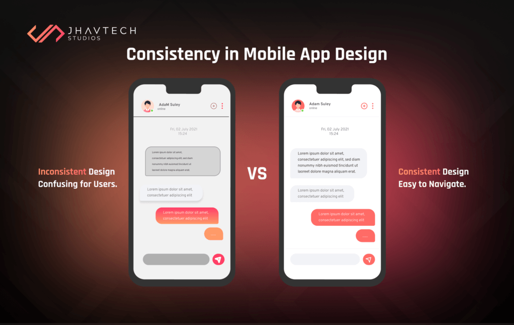
Make the Design Consistent
- Visual consistency – buttons, font, typefaces, and labels must be consistent
- Functional consistency – all interactive elements must work similarly.
- External consistency – the design must be consistent across multiple products so users can rely on prior knowledge/experience when using another product.
Here are a few suggestions on how to ensure consistent design:
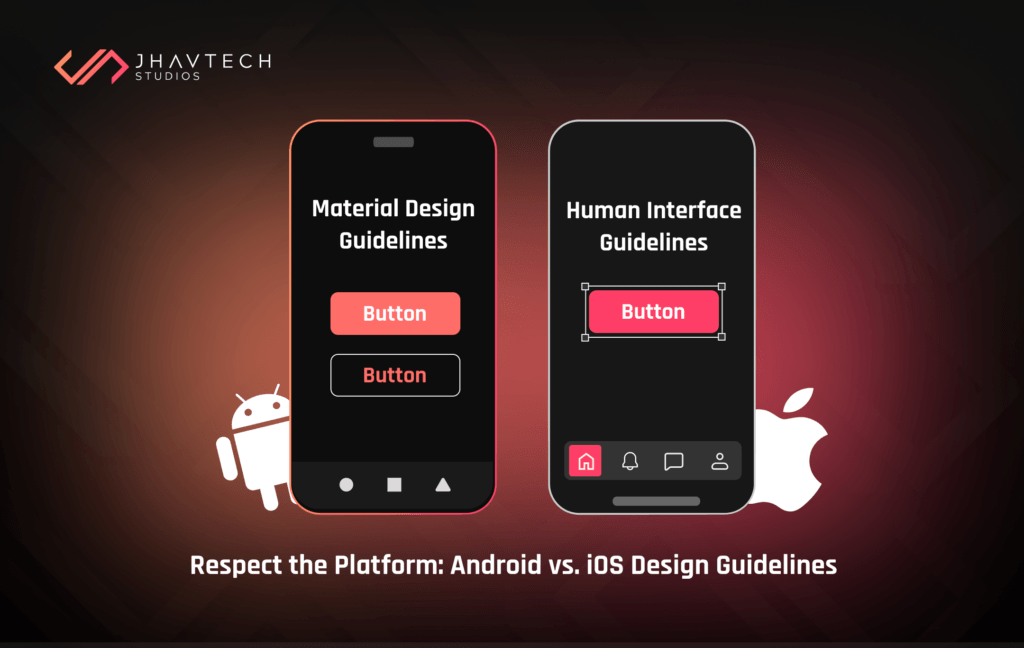
Adhere to platform guidelines
Every mobile operating system has standard guidelines for interface design. Google has its Material Design Guidelines, and Apple has its Human Interface Guidelines. When designing mobile apps for native platforms, make sure to follow the OS’ design guidelines for maximum quality. The rationale behind the strict adherence to design guidelines is simple: users become accustomed to the interaction patterns of each OS. As such, anything that goes against the guidelines will create friction and confusion
As you design and develop your mobile app for iOS or Android, don’t mimic the UI elements from other platforms. Icons, typefaces, and functional elements (i.e. input fields, checkboxes) must have a native feel. Try to use native components as much as possible so you can gain the trust of your target audience.
Put the User in Control
In order to create an exceptional mobile UI/UX, users must feel that they are in control of the app. This can be achieved by making the app deliver an element of control through consistency and predictability.
If users predict how to use an app and it turns out to be true, this gives the feeling and perception that they are in control. The ability to create this experience is a basic component of mobile app UI and UX design.
On mobile, users can’t hover over elements to gauge the type of interactivity that each element offers. This means it’s the designer’s responsibility to create consistent components and help users to determine what they want to do quickly.
Form follows function: the way an element looks must inform users what will occur when they use or interact with it. Never entwine designs with interaction. Failure to do this will annoy users and result in confusion.
Address Errors Properly
Errors happen when users engage with mobile apps. Sometimes they occur when the app fails. Sometimes they occur because the user commits a mistake. But regardless of the cause, errors and how they are addressed have a huge effect on user experience. Bad handling of errors and useless error messages will frustrate users and can become the reason for abandoning your app.
For instance, an error-state screen doesn’t help users understand what’s happening and what they can do to resolve it. Don’t presume that users are smart enough to figure things out. Always tell them what’s wrong in layman’s terms. Error messages must tell users the following:
- what went wrong and why
- what they should do to fix the error
Design an Accessible Interface
An accessible design enables users of all abilities to use apps conveniently. Take into account how users with vision loss, hearing impairment and other disabilities can use and interact with your mobile app.
Be Mindful About Color Blindness
Color blindness or color vision deficiency (CVD) affects approximately 300 million people in the world. It is more prevalent in males, affecting 1 in 12 men (8%) and 1 in 200 women across the globe. These are significant figures, but it’s easy to forget that this group of people will also use your app.
Here’s an example to put things in perspective. Error and success messages are often colored red and green, respectively. But red and green are the most affected colors by CVD. You’ve most likely seen this message when filling out a form: “The fields marked in red are required”. While this may not seem like a big issue, this message can be very frustrating for people who have CVD.
Color must not be used as the only visual means of conveying information, prompting a response, or calling for an action. It is important to use other visual cues to ensure that users can interact with an interface.
Make Navigation as Simple as Possible
Navigation is essential to user experience and its primary purpose is to allow users to consume content. This is the reason why users have contrasting concepts about content and navigation. Content is expected to be unique and exciting, while navigation is expected to be as simple and predictable as possible.
Helping users navigate easily must be a top priority when designing a mobile app. All the compelling content and cool features of your app won’t matter if users can’t find them. If it’s difficult to learn how to navigate your app, chances are you are going to lose a lot of users. They must be able to intuitively explore the app and complete all tasks without any explanation.
Use Standard Navigation Patterns
It’s advisable to use standard navigation components, like the navigation drawer for Android and the tab bar for iOS. Most users are already familiar with these navigation patterns so they will have no problems getting around your app.
Prioritise Navigation Options
Set your priorities based on the way users interact with your mobile app. Designate priority levels to common tasks and put emphasis in the UI to directions and destinations with frequent use and high priority levels. Organise your information structure in a manner that requires a minimum number of actions and screens. Save user from ‘decision paralysis’ by limiting navigation to four to eight items on the high priority levels.
Convey Current Location
Failing to communicate the users’ current location is a common problem of mobile app menus. “Where am I?” is a fundamental question that users need to answer to navigate successfully. They should know where they are in the app at any given time.
Avoid Mixing Navigation Patterns
After selecting a primary navigation pattern for your mobile app, stick to it and use it consistently. For instance, if your app has a tab bar in one section, there should not be a side drawer in another section.
You’ll also want to keep your main navigation menu consistent throughout the app. It must point to the top landing pages. A short mobile nav is a win-win for SEO/ASO and your users. It keeps the flow of link equity to the most important pages while helping users to navigate.
Make Search Part of Navigation
For most mobile app users, the search feature is an integral part of navigation. Take Amazon for example. It does not even put much importance with the category dropdown (although you can find it under ‘Departments’ if you need it). The most prominent thing at the top of the mobile view is the “Search” box.
Amazon has an immense catalog, but it does not expect users to browse through menus to find what they want. In most cases, users simply type in a product name, hit the search icon/button, and buy it directly. On mobile devices, the search box is the most direct route to what users need. Set it up and see to it that it works flawlessly.
Design for Seamless Onboarding
When it comes to UX for mobile apps, delivering exceptional onboarding is the key for retaining users. The onboarding process pertains to users’ first impression of your app and lays the groundwork for its adoption. Its main objective is to highlight the value that your app offers, including its benefits and features.
There are different onboarding strategies, but one is particularly effective: contextual onboarding. It means that instructions are only given when users need them. The app provides guidance as they go and only when needed. Another helpful feature during onboarding is an empty state, which is a screen whose default is blank and prompts users to take a few steps to populate it with data. Aside from informing users of the type of content they can expect on the page, an empty state is also effective in teaching users how to use your app. Even if onboarding is a single-step process, the guidance provided will reassure users that they’re doing the right thing.
Assert Your Value Proposition
When users download your mobile app, they are expecting it to provide value or solve an immediate problem. Right off the bat, you should inform users precisely what your app offers, what it will do for them, and how it will make life more convenient for them. You need to emphasise the core value instead of flaunting the fancy features of your app.
Make Registration Simple and Easy
mobile app needs to get users registered in order to deliver a personalised experience and increase conversions. But it is a process that requires a very careful approach.
Forcing users to provide personal information shortly after opening an app usually results in distraction and skepticism. They worry about being bombarded with marketing spiels after sharing their email. Bear in mind that users will download your app with the intent to browse, buy or find information about something. It would be wise to address these expectations first. Users must be convinced that your app will be able to solve their problem before they willingly provide any personal details. It’s a good idea to allow them to experience the app for a while and then subtly remind them to register after that.
In addition, filling in a registration form increases the possibilities of errors and other hassles that can drive users away. Mobile apps that won’t move forward unless users provide an email and password are more likely to be ditched for an alternate app. The same is true for apps that ask for too much information or those with a complex password authentication process. They often fail to get users on-board successfully.
Remember that people are busy and they don’t have time to spend 10 minutes just to sign up to your mobile app. Here are things that you can do to simplify the registration process:
- Allow users to skip registration or sign-up later
- Automatically enter their email from the app-store
- Ask for minimum permissions
- Provide context when asking personal information
- Get rid of any extra fields.
- Use polite language instead of generic instructions

Minimise the Need to Type
Typing on a smartphone and other mobile devices is not very comfortable and is often prone to errors. It is therefore a smart idea to keep the typing needs to a bare minimum. Again, as previously mentioned, keep forms simple with only the essential information required. Use the auto-complete feature wherever applicable. It is likewise advisable to customise the keyboard according to the type of query. Display a numeric keyboard when asking for pin, show a search button instead of Enter when searching, and include ‘@’ and ‘.com’ buttons when requesting for email IDs.
Load Swiftly
Users are demanding. They don’t have patience for an app that takes more than a few seconds to load. Studies reveal that the ideal loading time for an app is approximately two seconds. Anything north of it and you can expect high user abandonment rate. And with a so many apps in the market, users tend to gravitate towards those that deliver instant results.
In order for your app to compete, you must adopt ways that keep loading time in check. Achieving this is quite a tall order, but there are some ways that you can try to speed up the loading time.
- Keep http requests and re-directs to a minimum in order to keep server response times within tolerable levels. Use tools like CSS Sprites that combine several images into one, thereby reducing http requests.
- Optimise and resize images. While vibrant images are extremely useful in creating an engaging welcome page to boost user onboarding, high resolution photos generally take longer to load. Work on your images and determine the appropriate display size, resolution, and file format (JPEG, GIF, and PNG).
- Focus on loading content ‘Above the Fold’ first. This means, load the most important details that get seen first when a page opens. The rest of the content that appears after scrolling down can load in the background and become available when a user is done with the preliminary results. This leads to a smooth transition and keeps the user engaged while the page is still loading.
- Use compelling animation to retain users’ attention while they wait. Displaying a spinning wheel or a progress bar makes users impatient even if it’s only been a few seconds. According to a study, 20% of mobile app users claim that 3 seconds loading time is acceptable; 35% said they are willing to wait between 3 and 5 seconds. It’s therefore safe to say that if your pages take more than 5 seconds to load, expect half of the users to be gone.
Design for Fingers, NOT Cursors
When designing interactive elements in a mobile interface, it’s important to make touch targets big enough so they are easy for users to tap. Errors and mistaken taps frequently occur due to small touch controls.
When designing touch targets, you can follow recommendations from the MIT Touch Lab’s study to pick the appropriate size for interactive elements. The study found that the average size of finger pads is 10-14 mm, while fingertips are 8-10 mm. The figures indicate that 10 by 10 mm is the minimum touch target size.
Aside from the size of the target, it is also important to have ample space between targets. If multiple touch targets are close to each other (for instance, the ‘Agree’ and ‘Disagree’ buttons), make sure that there is a good amount of space between them.
Pay Attention to the Thumb Zone
The thumb zone pertains to the surface area of a mobile device screen that is most reachable and accessible by your thumb. This area provides the most convenience and ease of interaction for users to interact with elements in your app.
Aside from making targets big enough, consider the way people hold their mobile devices. Most of them hold their phone with one hand, but only a section of the screen is easily within reach for their thumbs. This area is called the ‘natural thumb zone’. Other zones require users to stretch their fingers or even change their grip to reach them. As a rule, the bigger the display, a larger area of the screen is less easily accessible.
Take into account all zones when designing for mobile apps:
- The green zone is the idea spot for navigation options and interactive actions like CTA buttons.
- The red zone is the ideal spot for danger options like Delete. Users are less likely to accidentally trigger this option.
Make It Easy to Go Back
Designers of successful mobile apps may find this difficult to believe, but some apps make it frustrating for users to take a step back. One click on the back button takes them all the way back to the homepage. But there are instances when clicking on the back button does nothing and sometimes there’s no back button at all!
A good app allows users to go back, take a second look, make corrections, or select another option in a single click, and then proceed with ease. It is also important to consider the placement of the back button. Android apps have the ‘Go Back’ button while iOS apps have it on the top left of the screen. Don’t make users search for it.
Final Words and Key Takeaways…
An exceptional mobile app design is the perfect blend of aesthetics and functionality, and that is precisely what you must strive to achieve. But don’t try to design a perfect app right on your first attempt. It’s almost impossible. The best thing to do is to treat your mobile app as an evolving project, and use data gathered from user feedback and testing sessions to improve both the user interface and user experience.
If you want to learn more about mobile app design or if you wish to engage our services, feel free to contact us to discuss your next project. We strive to answer all enquiries within 24 hours on business days. Our design and development services cover end-to-end creation of mobile apps, from Business Analysis and UI/UX design to deployment.


